
Home

Skyweaver progression system
Uncovering why players weren’t sticking around, then redesigning core progression into a clear, gamified system that motivates long-term play.
OVERVIEW
Design of Skyweaver's Season Pass and Daily Quest systems to boost retention and daily activity. Skypass set guided goals with rewards, while daily quests added incentives to increase engagement.
Skyweaver is a TCG that blends deep strategic gameplay with a visually striking high-fantasy world. Players collect, trade, and battle unique cards in a competitive environment. The game stands out with its rich mechanics, flexible strategies, and blockchain integration.
ROLE
UX/UI Design, User Research, Strategy, Animations, Art Direction
TIME
6 months
Defining the problem
I started looking at data
Retention data showed a steep drop-off in the first few days of play. The data team flagged this as a key issue impacting long-term engagement, and I set out to understand the underlying causes.
Then talked to real users
I conducted live interviews diving into player motivations, expectations, and frustrations.
- Why do people play Skyweaver?
- What kept them coming back - or not?
- How do they feel about the game progression?
The research reports became a key artifact for securing leadership buy-in, providing undeniable evidence of the retention problem through real user voices.
And connected the dots
To synthesize what I learned to stakeholders, I mapped the current game loop experience. This systems view revealed gaps between core activities and long-term incentives.
Defining the problem:
”How might we help players stay engaged in the early stages of the game?”
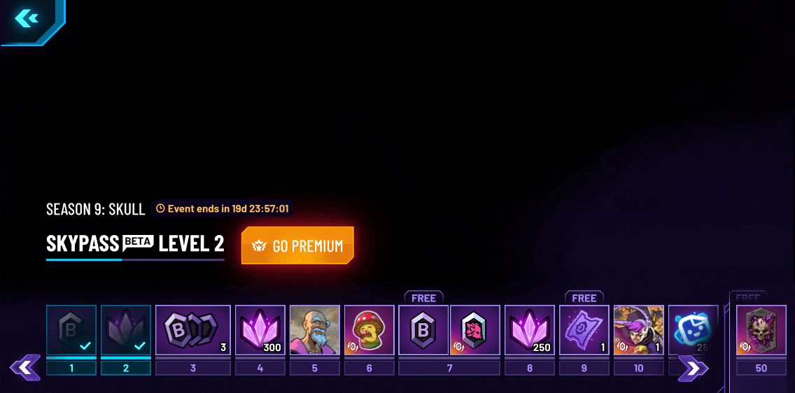
Goal 1
Design a Skypass battle-pass progression system to help destribute rewards
If we:
Add a Battlepass system with milestone rewards.
We will address:
Lack of long-term goals and reasons to return.
To do that, we need to:
Create clear, visible rewards tied to regular play.
To do that, we need to:
More retained users as they work toward meaningful progress.
We will measure by:
SkyPass milestone completion and Day 1–3 retention lift.
Goal 2
Design a quest system to help retention and onboarding
If we:
Add a quest system.
We will address:
Early confusion and unclear next steps.
To do that, we need to:
Design quests that teach core actions with fast feedback.
To do that, we need to:
Players stay longer by gaining clarity and early rewards.
We will measure by:
Players stay longer by gaining clarity and early rewards.
Design exploration
Started studying our competitors
To better understand common patterns and opportunities, I analyzed how top games structured their reward systems, progression, and monetization. This gave me a solid reference point to scope our own content needs more effectively.
⭐ Value added: Clear benchmarks that informed our content strategy and cross-team planning
Planned ahead
Knowing content creation would be critical at this project, I aligned with the art and community teams to assess effort vs. player desirability, helping us prioritize the right assets.
⭐ Value added: Team alignment and better scoping of content for the economy and game design team.
Validated wireframes early
Knowing content creation would be critical at this project, I aligned with the art and community teams to assess effort vs. player desirability, helping us prioritize the right assets.
⭐ Value added: Team alignment and better scoping of content for the economy and game design team.
Testing
I prepared and ran early usertest to validate key ideas and build a strong case for future leadership buy-in.
Prepared the prototype
I created a figma interactive prototype focused on quests, onboarding, and rewards to simulate the player experience without engineering overhead.
⭐ Value added: Testing without needing dev resources
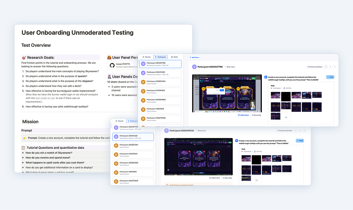
Gathered feedback
I ran an unmoderated test with gamers using Maze, tracking usability issues, and friction points across core flows like quest completion and reward claiming.
⭐ Value added: Direct input from players to spot friction early
And synthesized insights
I organized and summarized player feedback into themes, highlighting what worked, what confused users, and where expectations didn’t match the experience. These insights fed into our next design iteration.
⭐ Value added: Actionable clarity for the next design round
Iterations
After testing, I ran rapid iterations to address insights, improve clarity, and polish the experience before final designs were completed.
Players couldn't easily see the difference in rewards that gives more than one card, so we made the thumbnail wider to show it's a bigger reward clearly.
Players expected to be able to earn rewards even after completing the initial 50 levels, so we decided to add more rewards later for power users.
Players couldn’t tell when a reward was a tradable NFT, so we added a “Tradable Reward” badge to highlight premium rewards.
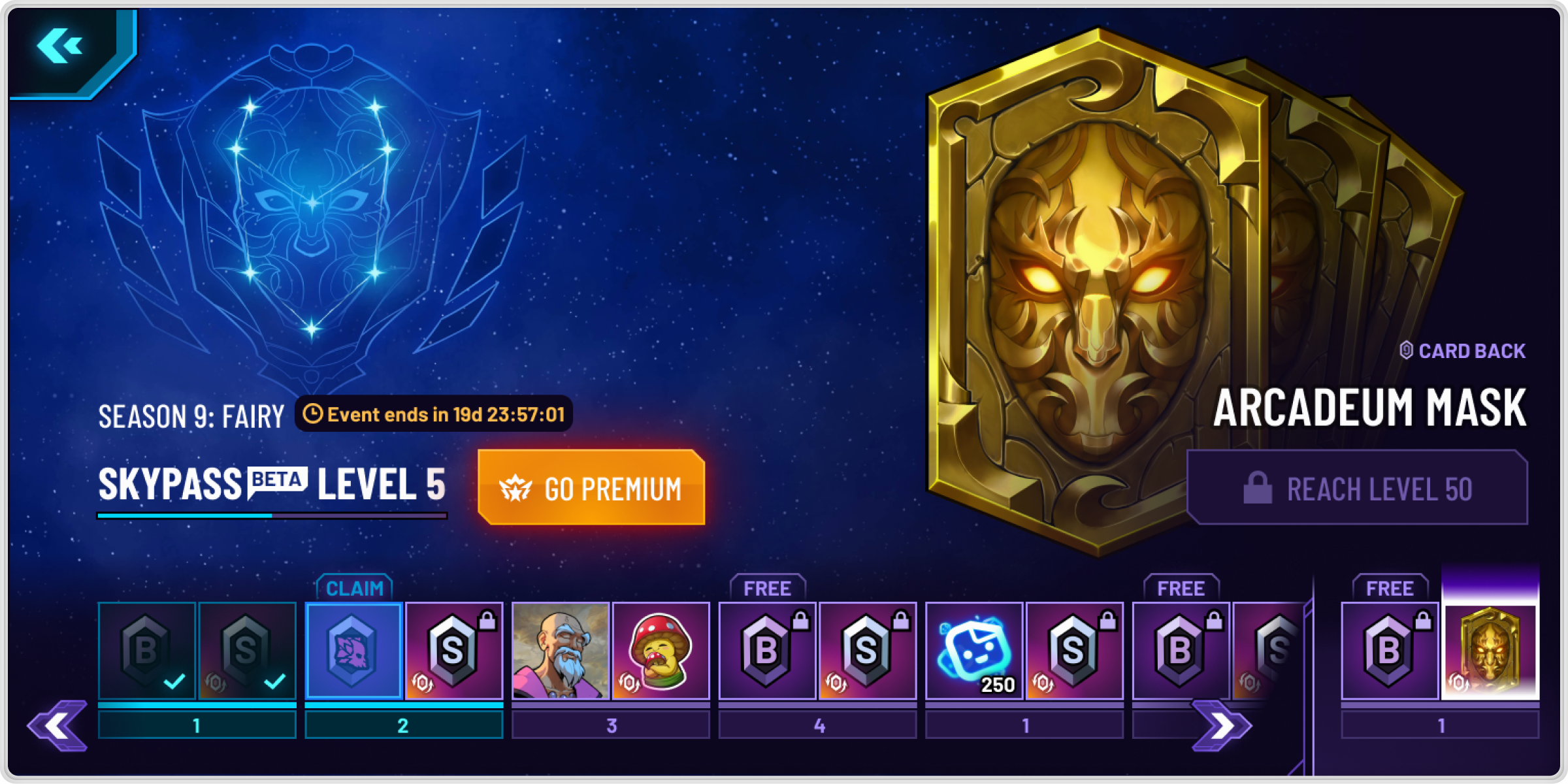
Final designs
At this stage, I made sure all content was in place, refined the flow for clarity and immersion, and focused on polishing the experience while prepping clean dev handoffs with specs.
Added ”game feel” delight
I layered in animations, transitions, and visuals to elevate the user experience aiming to make core interactions feel satisfying, responsive, and emotionally engaging.
⭐ Value added: Sharper emotional tone and immersion for retention
And prepared dev handoffs
I documented final specs, edge cases, and logic to give devs clarity and reduce ambiguity, paired with Loom walkthroughs recordings for easy asynchronous implementation.
⭐ Value added: Fewer blockers and tighter design-to-dev execution
Impact
D3 retention increased by 12.2%
The Skypass effectively created a consistent flow of content and incentivized the community to engage. It also set expectations for the rewards players would see the following month. This approach fostered a sense of engagement as players eagerly anticipated the next month's rewards.
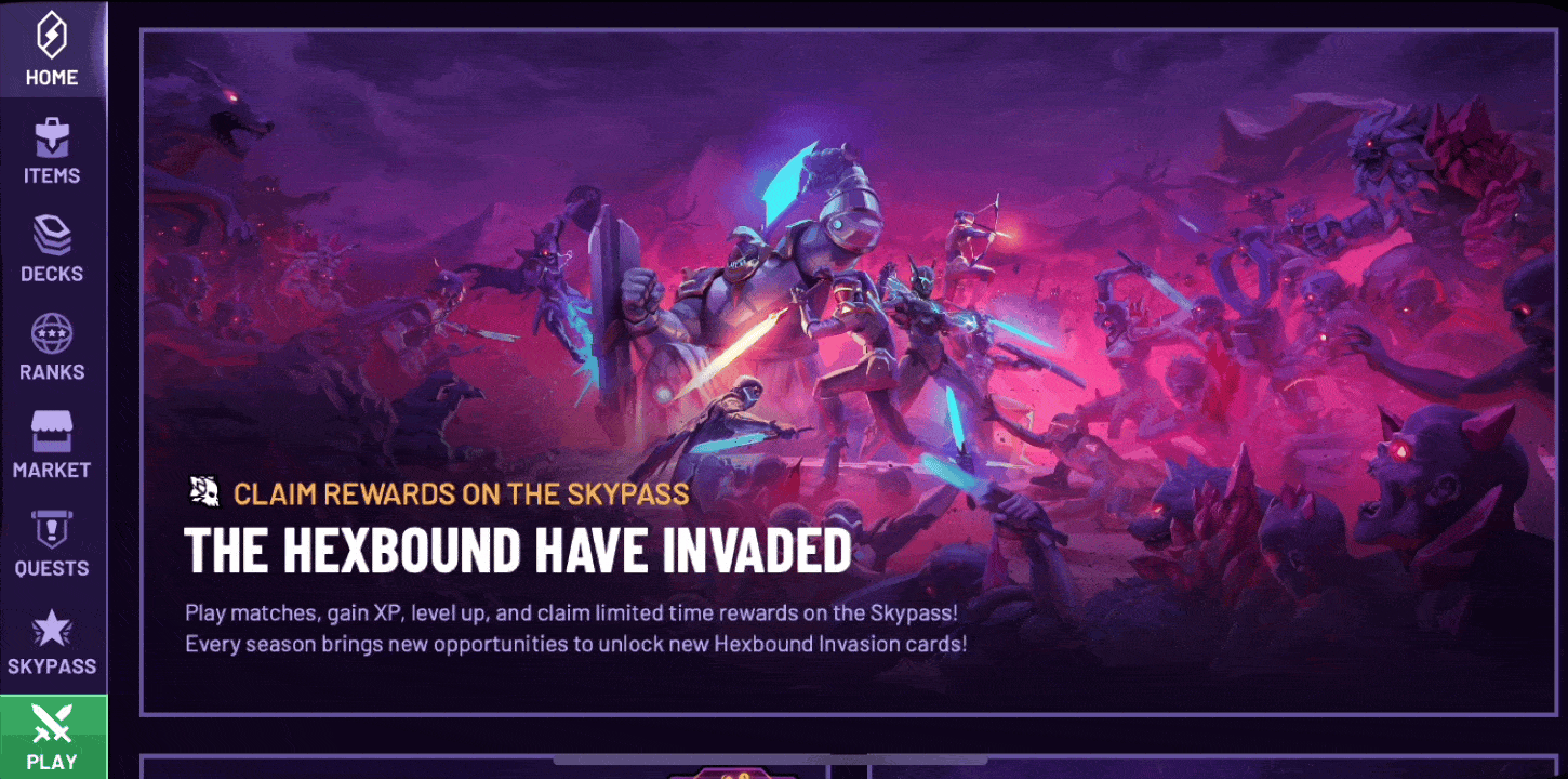
Additionally, with each Skypass, we released a patch introducing new cards that slightly shifted the meta. This monthly schedule created a sense of novelty, as players knew that every 30 days, there would be new combos to explore and cards to collect.
Future challenges & opportunities
Many players believe the Skypass is overpriced compared to other games, even though it includes tradable blockchain assets that can be resold. To address this concern, we started exploring adding free, non-tradable rewards to offer additional content for premium Skypass buyers.
Learnings
🌱 Clear handoffs and async Loom videos helped bridge the design–dev gap
Working in a fully remote setup challenged me to rethink how I communicate design intent. I started recording short Loom walkthroughs to explain key flows, edge cases, and interaction patterns - something words or static mocks alone couldn’t always capture. I also kept every ticket updated with the latest specs, ensuring no detail was lost in translation. This helped developers feel confident, reduced back-and-forth, and made async work feel more human and connected.
🌱 ”Game Feel” was essential to player engagement and immersion
Through this project, I saw firsthand how subtle motion and sound could transform the experience. A tiny delay, a satisfying sound, or a bounce in an animation made a card interaction feel right. These weren’t just polish they were functional cues that helped players understand the game and feel rewarded for engaging. Tuning this feedback loop with the team helped us create a more immersive, intuitive game that taught itself through feel, not just instructions.
Thank you for reading :)
Back to home
Home
Skyweaver progression system
Uncovering why players weren’t sticking around, then redesigning core progression into a clear, gamified system that motivates long-term play.
OVERVIEW
Design of Skyweaver's Season Pass and Daily Quest systems to boost retention and daily activity. Skypass set guided goals with rewards, while daily quests added incentives to increase engagement.
Skyweaver is a TCG that blends deep strategic gameplay with a visually striking high-fantasy world. Players collect, trade, and battle unique cards in a competitive environment. The game stands out with its rich mechanics, flexible strategies, and blockchain integration.
ROLE
UX/UI Design, User Research, Strategy, Animations, Art Direction
TIME
6 months
Defining the problem
I started looking at data
Retention data showed a steep drop-off in the first few days of play. The data team flagged this as a key issue impacting long-term engagement, and I set out to understand the underlying causes.
Then talked to real users
I conducted live interviews diving into player motivations, expectations, and frustrations.
- Why do people play Skyweaver?
- What kept them coming back - or not?
- How do they feel about the game progression?
The research reports became a key artifact for securing leadership buy-in, providing undeniable evidence of the retention problem through real user voices.
And connected the dots
To synthesize what I learned to stakeholders, I mapped the current game loop experience. This systems view revealed gaps between core activities and long-term incentives.
Defining the problem:
”How might we help players stay engaged in the early stages of the game?”
Goal 1
Design a Skypass battle-pass progression system to help destribute rewards
If we:
Add a Battlepass system with milestone rewards.
We will address:
Lack of long-term goals and reasons to return.
To do that, we need to:
Create clear, visible rewards tied to regular play.
To do that, we need to:
More retained users as they work toward meaningful progress.
We will measure by:
SkyPass milestone completion and Day 1–3 retention lift.
Goal 2
Design a quest system to help retention and onboarding
If we:
Add a quest system.
We will address:
Early confusion and unclear next steps.
To do that, we need to:
Design quests that teach core actions with fast feedback.
To do that, we need to:
Players stay longer by gaining clarity and early rewards.
We will measure by:
Players stay longer by gaining clarity and early rewards.
Design exploration
Started studying our competitors
To better understand common patterns and opportunities, I analyzed how top games structured their reward systems, progression, and monetization. This gave me a solid reference point to scope our own content needs more effectively.
⭐ Value added: Clear benchmarks that informed our content strategy and cross-team planning
Planned ahead
Knowing content creation would be critical at this project, I aligned with the art and community teams to assess effort vs. player desirability, helping us prioritize the right assets.
⭐ Value added: Team alignment and better scoping of content for the economy and game design team.
Validated wireframes early
Knowing content creation would be critical at this project, I aligned with the art and community teams to assess effort vs. player desirability, helping us prioritize the right assets.
⭐ Value added: Team alignment and better scoping of content for the economy and game design team.
Testing
I prepared and ran early usertest to validate key ideas and build a strong case for future leadership buy-in.
Prepared the prototype
I created a figma interactive prototype focused on quests, onboarding, and rewards to simulate the player experience without engineering overhead.
⭐ Value added: Testing without needing dev resources
Gathered feedback
I ran an unmoderated test with gamers using Maze, tracking usability issues, and friction points across core flows like quest completion and reward claiming.
⭐ Value added: Direct input from players to spot friction early
And synthesized insights
I organized and summarized player feedback into themes, highlighting what worked, what confused users, and where expectations didn’t match the experience. These insights fed into our next design iteration.
⭐ Value added: Actionable clarity for the next design round
Iterations
After testing, I ran rapid iterations to address insights, improve clarity, and polish the experience before final designs were completed.
Players couldn't easily see the difference in rewards that gives more than one card, so we made the thumbnail wider to show it's a bigger reward clearly.
Players expected to be able to earn rewards even after completing the initial 50 levels, so we decided to add more rewards later for power users.
Players couldn’t tell when a reward was a tradable NFT, so we added a “Tradable Reward” badge to highlight premium rewards.
Final designs
At this stage, I made sure all content was in place, refined the flow for clarity and immersion, and focused on polishing the experience while prepping clean dev handoffs with specs.
Added ”game feel” delight
I layered in animations, transitions, and visuals to elevate the user experience aiming to make core interactions feel satisfying, responsive, and emotionally engaging.
⭐ Value added: Sharper emotional tone and immersion for retention
And prepared dev handoffs
I documented final specs, edge cases, and logic to give devs clarity and reduce ambiguity, paired with Loom walkthroughs recordings for easy asynchronous implementation.
⭐ Value added: Fewer blockers and tighter design-to-dev execution
Impact
D3 retention increased by 12.2%
The Skypass effectively created a consistent flow of content and incentivized the community to engage. It also set expectations for the rewards players would see the following month. This approach fostered a sense of engagement as players eagerly anticipated the next month's rewards.
Additionally, with each Skypass, we released a patch introducing new cards that slightly shifted the meta. This monthly schedule created a sense of novelty, as players knew that every 30 days, there would be new combos to explore and cards to collect.
Future challenges & opportunities
Many players believe the Skypass is overpriced compared to other games, even though it includes tradable blockchain assets that can be resold. To address this concern, we started exploring adding free, non-tradable rewards to offer additional content for premium Skypass buyers.
Learnings
🌱 Clear handoffs and async Loom videos helped bridge the design–dev gap
Working in a fully remote setup challenged me to rethink how I communicate design intent. I started recording short Loom walkthroughs to explain key flows, edge cases, and interaction patterns - something words or static mocks alone couldn’t always capture. I also kept every ticket updated with the latest specs, ensuring no detail was lost in translation. This helped developers feel confident, reduced back-and-forth, and made async work feel more human and connected.
🌱 ”Game Feel” was essential to player engagement and immersion
Through this project, I saw firsthand how subtle motion and sound could transform the experience. A tiny delay, a satisfying sound, or a bounce in an animation made a card interaction feel right. These weren’t just polish they were functional cues that helped players understand the game and feel rewarded for engaging. Tuning this feedback loop with the team helped us create a more immersive, intuitive game that taught itself through feel, not just instructions.
Thank you for reading :)
Back to home